Plotting#
Introduction#
Labeled data enables expressive computations. These same labels can also be used to easily create informative plots.
Xarray’s plotting capabilities are centered around
DataArray objects.
To plot Dataset objects
simply access the relevant DataArrays, i.e. dset['var1'].
Dataset specific plotting routines are also available (see Datasets).
Here we focus mostly on arrays 2d or larger. If your data fits
nicely into a pandas DataFrame then you’re better off using one of the more
developed tools there.
Xarray plotting functionality is a thin wrapper around the popular matplotlib library. Matplotlib syntax and function names were copied as much as possible, which makes for an easy transition between the two. Matplotlib must be installed before xarray can plot.
To use xarray’s plotting capabilities with time coordinates containing
cftime.datetime objects
nc-time-axis v1.3.0 or later
needs to be installed.
For more extensive plotting applications consider the following projects:
Seaborn: “provides a high-level interface for drawing attractive statistical graphics.” Integrates well with pandas.
HoloViews and GeoViews: “Composable, declarative data structures for building even complex visualizations easily.” Includes native support for xarray objects.
hvplot:
hvplotmakes it very easy to produce dynamic plots (backed byHoloviewsorGeoviews) by adding ahvplotaccessor to DataArrays.Cartopy: Provides cartographic tools.
Imports#
The following imports are necessary for all of the examples.
In [1]: import numpy as np

In [2]: import pandas as pd

In [3]: import matplotlib.pyplot as plt

In [4]: import xarray as xr
For these examples we’ll use the North American air temperature dataset.
In [5]: airtemps = xr.tutorial.open_dataset("air_temperature")

In [6]: airtemps
Out[6]:
<xarray.Dataset> Size: 31MB
Dimensions:  (lat: 25, time: 2920, lon: 53)
Coordinates:
  * lat      (lat) float32 100B 75.0 72.5 70.0 67.5 65.0 ... 22.5 20.0 17.5 15.0
  * lon      (lon) float32 212B 200.0 202.5 205.0 207.5 ... 325.0 327.5 330.0
  * time     (time) datetime64[ns] 23kB 2013-01-01 ... 2014-12-31T18:00:00
Data variables:
    air      (time, lat, lon) float64 31MB ...
Attributes:
    Conventions:  COARDS
    title:        4x daily NMC reanalysis (1948)
    description:  Data is from NMC initialized reanalysis\n(4x/day).  These a...
    platform:     Model
    references:   http://www.esrl.noaa.gov/psd/data/gridded/data.ncep.reanaly...

# Convert to celsius
In [7]: air = airtemps.air - 273.15

# copy attributes to get nice figure labels and change Kelvin to Celsius
In [8]: air.attrs = airtemps.air.attrs

In [9]: air.attrs["units"] = "deg C"
Note
Until GH1614 is solved, you might need to copy over the metadata in attrs to get informative figure labels (as was done above).
DataArrays#
One Dimension#
Simple Example#
The simplest way to make a plot is to call the DataArray.plot() method.
In [10]: air1d = air.isel(lat=10, lon=10)

In [11]: air1d.plot()
Out[11]: [<matplotlib.lines.Line2D at 0x7f66f17b4a00>]
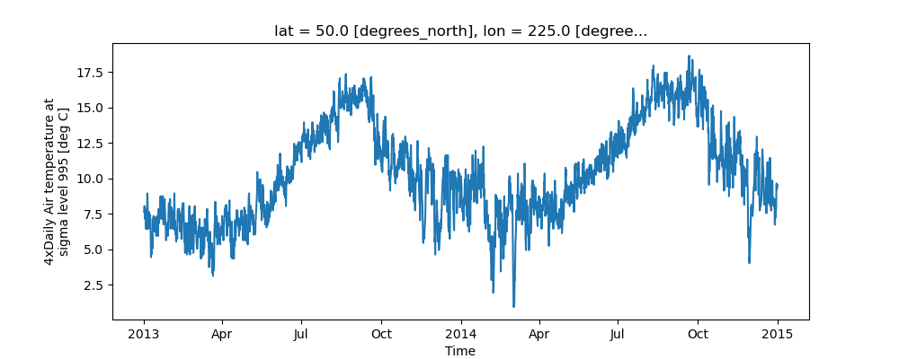
Xarray uses the coordinate name along with metadata attrs.long_name,
attrs.standard_name, DataArray.name and attrs.units (if available)
to label the axes.
The names long_name, standard_name and units are copied from the
CF-conventions spec.
When choosing names, the order of precedence is long_name, standard_name and finally DataArray.name.
The y-axis label in the above plot was constructed from the long_name and units attributes of air1d.
In [12]: air1d.attrs
Out[12]:
{'long_name': '4xDaily Air temperature at sigma level 995',
 'units': 'deg C',
 'precision': 2,
 'GRIB_id': 11,
 'GRIB_name': 'TMP',
 'var_desc': 'Air temperature',
 'dataset': 'NMC Reanalysis',
 'level_desc': 'Surface',
 'statistic': 'Individual Obs',
 'parent_stat': 'Other',
 'actual_range': array([185.16, 322.1 ], dtype=float32)}
Additional Arguments#
Additional arguments are passed directly to the matplotlib function which
does the work.
For example, xarray.plot.line() calls
matplotlib.pyplot.plot passing in the index and the array values as x and y, respectively.
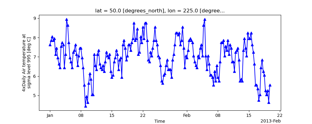
So to make a line plot with blue triangles a matplotlib format string
can be used:
In [13]: air1d[:200].plot.line("b-^")
Out[13]: [<matplotlib.lines.Line2D at 0x7f66f083c220>]
Note
Not all xarray plotting methods support passing positional arguments to the wrapped matplotlib functions, but they do all support keyword arguments.
Keyword arguments work the same way, and are more explicit.
In [14]: air1d[:200].plot.line(color="purple", marker="o")
Out[14]: [<matplotlib.lines.Line2D at 0x7f66f0879540>]

Adding to Existing Axis#
To add the plot to an existing axis pass in the axis as a keyword argument
ax. This works for all xarray plotting methods.
In this example axs is an array consisting of the left and right
axes created by plt.subplots.
In [15]: fig, axs = plt.subplots(ncols=2)

In [16]: axs
Out[16]: array([<Axes: >, <Axes: >], dtype=object)

In [17]: air1d.plot(ax=axs[0])
Out[17]: [<matplotlib.lines.Line2D at 0x7f66f209ab00>]

In [18]: air1d.plot.hist(ax=axs[1])
Out[18]:
(array([  9.,  38., 255., 584., 542., 489., 368., 258., 327.,  50.]),
 array([ 0.95 ,  2.719,  4.488, ..., 15.102, 16.871, 18.64 ]),
 <BarContainer object of 10 artists>)

In [19]: plt.tight_layout()

In [20]: plt.draw()

On the right is a histogram created by xarray.plot.hist().
Controlling the figure size#
You can pass a figsize argument to all xarray’s plotting methods to
control the figure size. For convenience, xarray’s plotting methods also
support the aspect and size arguments which control the size of the
resulting image via the formula figsize = (aspect * size, size):
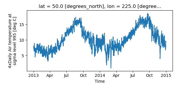
In [21]: air1d.plot(aspect=2, size=3)
Out[21]: [<matplotlib.lines.Line2D at 0x7f66f04c3250>]

In [22]: plt.tight_layout()
This feature also works with Faceting. For facet plots,
size and aspect refer to a single panel (so that aspect * size
gives the width of each facet in inches), while figsize refers to the
entire figure (as for matplotlib’s figsize argument).
Note
If figsize or size are used, a new figure is created,
so this is mutually exclusive with the ax argument.
Note
The convention used by xarray (figsize = (aspect * size, size)) is
borrowed from seaborn: it is therefore not equivalent to matplotlib’s.
Determine x-axis values#
Per default dimension coordinates are used for the x-axis (here the time coordinates). However, you can also use non-dimension coordinates, MultiIndex levels, and dimensions without coordinates along the x-axis. To illustrate this, let’s calculate a ‘decimal day’ (epoch) from the time and assign it as a non-dimension coordinate:
In [23]: decimal_day = (air1d.time - air1d.time[0]) / pd.Timedelta("1d")

In [24]: air1d_multi = air1d.assign_coords(decimal_day=("time", decimal_day.data))

In [25]: air1d_multi
Out[25]:
<xarray.DataArray 'air' (time: 2920)> Size: 23kB
array([7.64, 7.85, 8.05, ..., 9.34, 9.34, 9.54])
Coordinates:
    lat          float32 4B 50.0
    lon          float32 4B 225.0
  * time         (time) datetime64[ns] 23kB 2013-01-01 ... 2014-12-31T18:00:00
    decimal_day  (time) float64 23kB 0.0 0.25 0.5 0.75 ... 729.2 729.5 729.8
Attributes:
    long_name:     4xDaily Air temperature at sigma level 995
    units:         deg C
    precision:     2
    GRIB_id:       11
    GRIB_name:     TMP
    var_desc:      Air temperature
    dataset:       NMC Reanalysis
    level_desc:    Surface
    statistic:     Individual Obs
    parent_stat:   Other
    actual_range:  [185.16 322.1 ]
To use 'decimal_day' as x coordinate it must be explicitly specified:
In [26]: air1d_multi.plot(x="decimal_day")
Out[26]: [<matplotlib.lines.Line2D at 0x7f66f2206470>]
Creating a new MultiIndex named 'date' from 'time' and 'decimal_day',
it is also possible to use a MultiIndex level as x-axis:
In [27]: air1d_multi = air1d_multi.set_index(date=("time", "decimal_day"))

In [28]: air1d_multi.plot(x="decimal_day")
Out[28]: [<matplotlib.lines.Line2D at 0x7f66f2207400>]
Finally, if a dataset does not have any coordinates it enumerates all data points:
In [29]: air1d_multi = air1d_multi.drop_vars(["date", "time", "decimal_day"])

In [30]: air1d_multi.plot()
Out[30]: [<matplotlib.lines.Line2D at 0x7f66f2204460>]
The same applies to 2D plots below.
Multiple lines showing variation along a dimension#
It is possible to make line plots of two-dimensional data by calling xarray.plot.line()
with appropriate arguments. Consider the 3D variable air defined above. We can use line
plots to check the variation of air temperature at three different latitudes along a longitude line:
In [31]: air.isel(lon=10, lat=[19, 21, 22]).plot.line(x="time")
Out[31]:
[<matplotlib.lines.Line2D at 0x7f66f213c160>,
 <matplotlib.lines.Line2D at 0x7f66f22430d0>,
 <matplotlib.lines.Line2D at 0x7f66f2241cc0>]
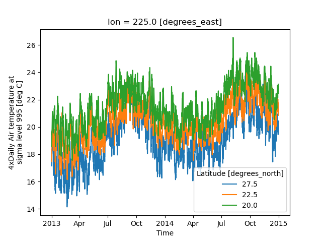
It is required to explicitly specify either
x: the dimension to be used for the x-axis, orhue: the dimension you want to represent by multiple lines.
Thus, we could have made the previous plot by specifying hue='lat' instead of x='time'.
If required, the automatic legend can be turned off using add_legend=False. Alternatively,
hue can be passed directly to xarray.plot.line() as air.isel(lon=10, lat=[19,21,22]).plot.line(hue=’lat’).
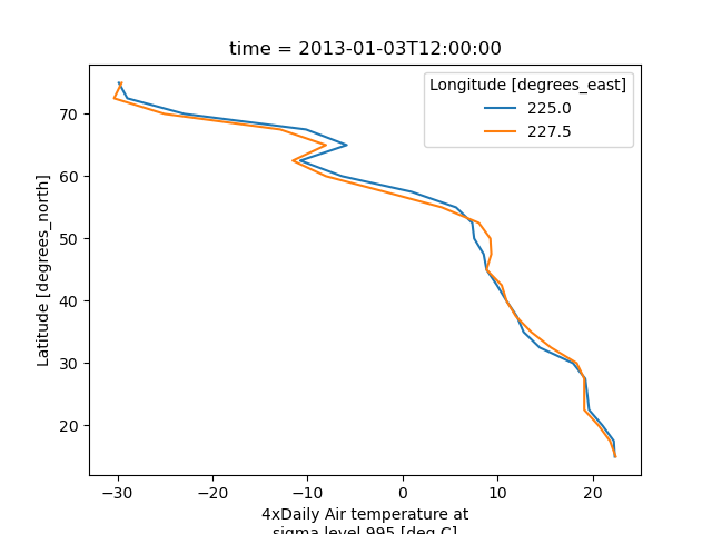
Dimension along y-axis#
It is also possible to make line plots such that the data are on the x-axis and a dimension is on the y-axis. This can be done by specifying the appropriate y keyword argument.
In [32]: air.isel(time=10, lon=[10, 11]).plot(y="lat", hue="lon")
Out[32]:
[<matplotlib.lines.Line2D at 0x7f66f2240070>,
 <matplotlib.lines.Line2D at 0x7f66f2240b80>]
Step plots#
As an alternative, also a step plot similar to matplotlib’s plt.step can be
made using 1D data.
In [33]: air1d[:20].plot.step(where="mid")
Out[33]: [<matplotlib.lines.Line2D at 0x7f66f18bd8a0>]

The argument where defines where the steps should be placed, options are
'pre' (default), 'post', and 'mid'. This is particularly handy
when plotting data grouped with Dataset.groupby_bins().
In [34]: air_grp = air.mean(["time", "lon"]).groupby_bins("lat", [0, 23.5, 66.5, 90])

In [35]: air_mean = air_grp.mean()

In [36]: air_std = air_grp.std()

In [37]: air_mean.plot.step()
Out[37]: [<matplotlib.lines.Line2D at 0x7f66f24a6740>]

In [38]: (air_mean + air_std).plot.step(ls=":")
Out[38]: [<matplotlib.lines.Line2D at 0x7f66f24a6920>]

In [39]: (air_mean - air_std).plot.step(ls=":")
Out[39]: [<matplotlib.lines.Line2D at 0x7f66f24a48e0>]

In [40]: plt.ylim(-20, 30)
Out[40]: (-20.0, 30.0)

In [41]: plt.title("Zonal mean temperature")
Out[41]: Text(0.5, 1.0, 'Zonal mean temperature')
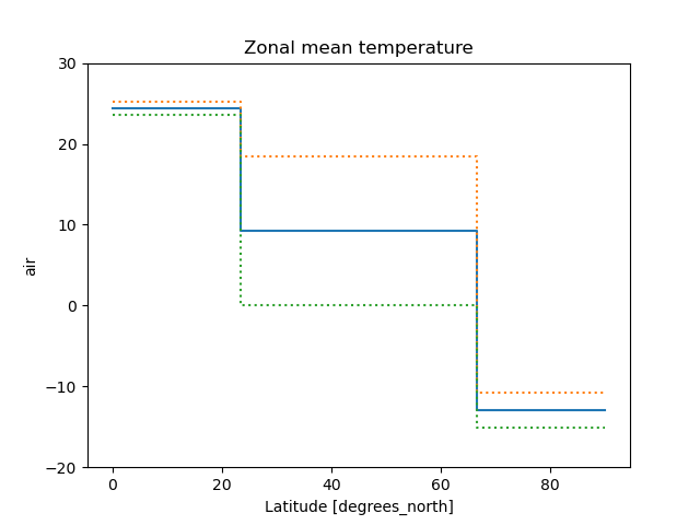
In this case, the actual boundaries of the bins are used and the where argument
is ignored.
Other axes kwargs#
The keyword arguments xincrease and yincrease let you control the axes direction.
In [42]: air.isel(time=10, lon=[10, 11]).plot.line(
   ....:     y="lat", hue="lon", xincrease=False, yincrease=False
   ....: )
   ....:
Out[42]:
[<matplotlib.lines.Line2D at 0x7f66f21e61d0>,
 <matplotlib.lines.Line2D at 0x7f66f21e5db0>]
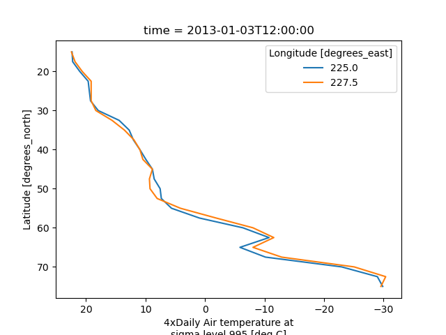
In addition, one can use xscale, yscale to set axes scaling;
xticks, yticks to set axes ticks and xlim, ylim to set axes limits.
These accept the same values as the matplotlib methods ax.set_(x,y)scale(),
ax.set_(x,y)ticks(), ax.set_(x,y)lim(), respectively.
Two Dimensions#
Simple Example#
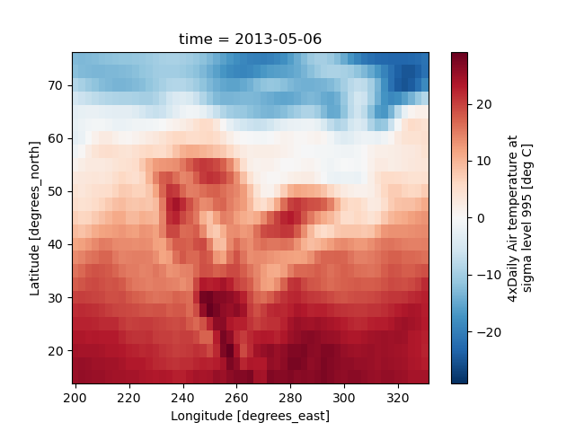
The default method DataArray.plot() calls xarray.plot.pcolormesh()
by default when the data is two-dimensional.
In [43]: air2d = air.isel(time=500)

In [44]: air2d.plot()
Out[44]: <matplotlib.collections.QuadMesh at 0x7f66f229cf10>
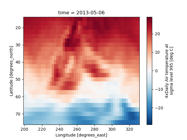
All 2d plots in xarray allow the use of the keyword arguments yincrease
and xincrease.
In [45]: air2d.plot(yincrease=False)
Out[45]: <matplotlib.collections.QuadMesh at 0x7f66f229ca30>
Note
We use xarray.plot.pcolormesh() as the default two-dimensional plot
method because it is more flexible than xarray.plot.imshow().
However, for large arrays, imshow can be much faster than pcolormesh.
If speed is important to you and you are plotting a regular mesh, consider
using imshow.
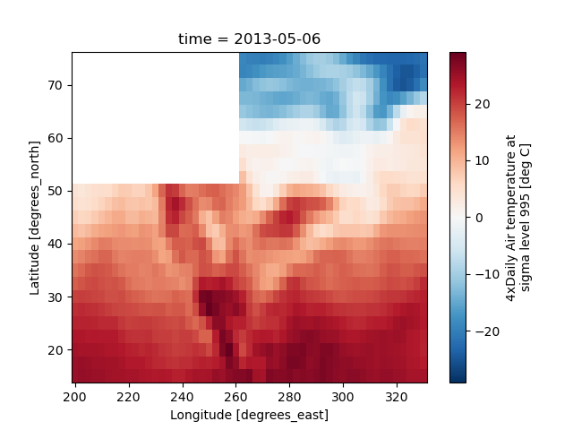
Missing Values#
Xarray plots data with Missing values.
In [46]: bad_air2d = air2d.copy()

In [47]: bad_air2d[dict(lat=slice(0, 10), lon=slice(0, 25))] = np.nan

In [48]: bad_air2d.plot()
Out[48]: <matplotlib.collections.QuadMesh at 0x7f66f23d9150>
Nonuniform Coordinates#
It’s not necessary for the coordinates to be evenly spaced. Both
xarray.plot.pcolormesh() (default) and xarray.plot.contourf() can
produce plots with nonuniform coordinates.
In [49]: b = air2d.copy()

# Apply a nonlinear transformation to one of the coords
In [50]: b.coords["lat"] = np.log(b.coords["lat"])

In [51]: b.plot()
Out[51]: <matplotlib.collections.QuadMesh at 0x7f66f20322c0>
Other types of plot#
There are several other options for plotting 2D data.
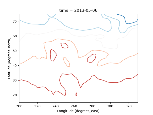
Contour plot using DataArray.plot.contour()
In [52]: air2d.plot.contour()
Out[52]: <matplotlib.contour.QuadContourSet at 0x7f66f23b4cd0>
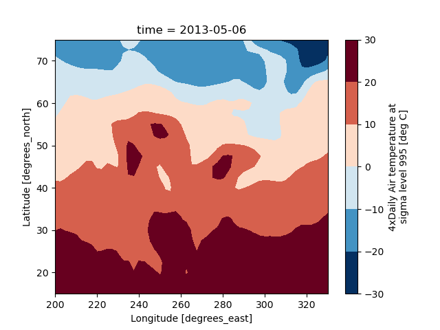
Filled contour plot using DataArray.plot.contourf()
In [53]: air2d.plot.contourf()
Out[53]: <matplotlib.contour.QuadContourSet at 0x7f66f257f640>
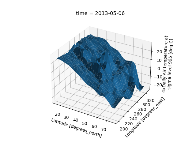
Surface plot using DataArray.plot.surface()
# transpose just to make the example look a bit nicer
In [54]: air2d.T.plot.surface()
Out[54]: <mpl_toolkits.mplot3d.art3d.Poly3DCollection at 0x7f66f2ec2230>
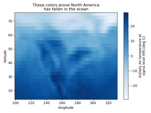
Calling Matplotlib#
Since this is a thin wrapper around matplotlib, all the functionality of matplotlib is available.
In [55]: air2d.plot(cmap=plt.cm.Blues)
Out[55]: <matplotlib.collections.QuadMesh at 0x7f66f00d9060>

In [56]: plt.title("These colors prove North America\nhas fallen in the ocean")
Out[56]: Text(0.5, 1.0, 'These colors prove North America\nhas fallen in the ocean')

In [57]: plt.ylabel("latitude")
Out[57]: Text(0, 0.5, 'latitude')

In [58]: plt.xlabel("longitude")
Out[58]: Text(0.5, 0, 'longitude')

In [59]: plt.tight_layout()

In [60]: plt.draw()
Note
Xarray methods update label information and generally play around with the
axes. So any kind of updates to the plot
should be done after the call to the xarray’s plot.
In the example below, plt.xlabel effectively does nothing, since
d_ylog.plot() updates the xlabel.
In [61]: plt.xlabel("Never gonna see this.")
Out[61]: Text(0.5, 0, 'Never gonna see this.')

In [62]: air2d.plot()
Out[62]: <matplotlib.collections.QuadMesh at 0x7f66f00dbf40>

In [63]: plt.draw()

Colormaps#
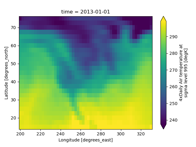
Xarray borrows logic from Seaborn to infer what kind of color map to use. For example, consider the original data in Kelvins rather than Celsius:
In [64]: airtemps.air.isel(time=0).plot()
Out[64]: <matplotlib.collections.QuadMesh at 0x7f66eeb67a30>
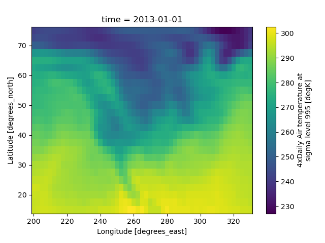
The Celsius data contain 0, so a diverging color map was used. The Kelvins do not have 0, so the default color map was used.
Robust#
Outliers often have an extreme effect on the output of the plot. Here we add two bad data points. This affects the color scale, washing out the plot.
In [65]: air_outliers = airtemps.air.isel(time=0).copy()

In [66]: air_outliers[0, 0] = 100

In [67]: air_outliers[-1, -1] = 400

In [68]: air_outliers.plot()
Out[68]: <matplotlib.collections.QuadMesh at 0x7f66eeb65300>

This plot shows that we have outliers. The easy way to visualize
the data without the outliers is to pass the parameter
robust=True.
This will use the 2nd and 98th
percentiles of the data to compute the color limits.
In [69]: air_outliers.plot(robust=True)
Out[69]: <matplotlib.collections.QuadMesh at 0x7f66ee8bd060>
Observe that the ranges of the color bar have changed. The arrows on the color bar indicate that the colors include data points outside the bounds.
Discrete Colormaps#
It is often useful, when visualizing 2d data, to use a discrete colormap,
rather than the default continuous colormaps that matplotlib uses. The
levels keyword argument can be used to generate plots with discrete
colormaps. For example, to make a plot with 8 discrete color intervals:
In [70]: air2d.plot(levels=8)
Out[70]: <matplotlib.collections.QuadMesh at 0x7f66ee8bddb0>
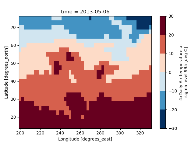
It is also possible to use a list of levels to specify the boundaries of the discrete colormap:
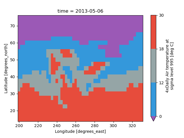
In [71]: air2d.plot(levels=[0, 12, 18, 30])
Out[71]: <matplotlib.collections.QuadMesh at 0x7f66ee7a8460>
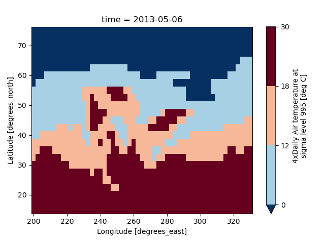
You can also specify a list of discrete colors through the colors argument:
In [72]: flatui = ["#9b59b6", "#3498db", "#95a5a6", "#e74c3c", "#34495e", "#2ecc71"]

In [73]: air2d.plot(levels=[0, 12, 18, 30], colors=flatui)
Out[73]: <matplotlib.collections.QuadMesh at 0x7f66ee7aa410>
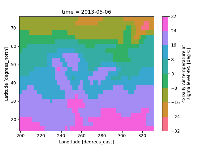
Finally, if you have Seaborn
installed, you can also specify a seaborn color palette to the cmap
argument. Note that levels must be specified with seaborn color palettes
if using imshow or pcolormesh (but not with contour or contourf,
since levels are chosen automatically).
In [74]: air2d.plot(levels=10, cmap="husl")
Out[74]: <matplotlib.collections.QuadMesh at 0x7f66ee346500>

In [75]: plt.draw()
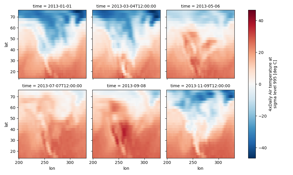
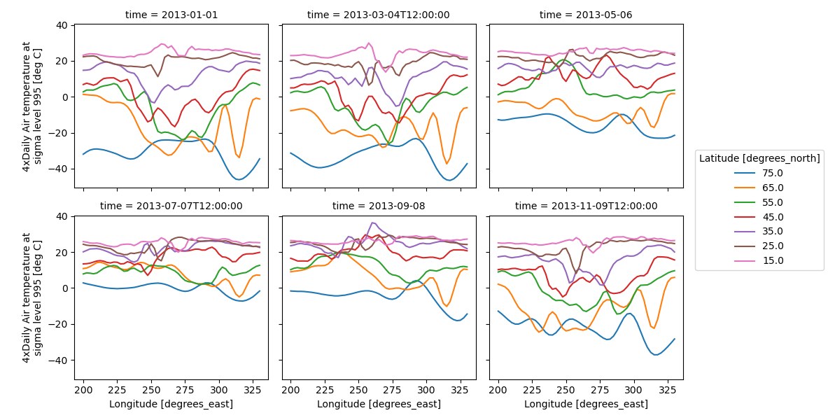
Faceting#
Faceting here refers to splitting an array along one or two dimensions and plotting each group. Xarray’s basic plotting is useful for plotting two dimensional arrays. What about three or four dimensional arrays? That’s where facets become helpful. The general approach to plotting here is called “small multiples”, where the same kind of plot is repeated multiple times, and the specific use of small multiples to display the same relationship conditioned on one or more other variables is often called a “trellis plot”.
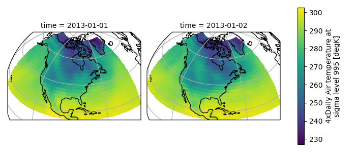
Consider the temperature data set. There are 4 observations per day for two years which makes for 2920 values along the time dimension. One way to visualize this data is to make a separate plot for each time period.
The faceted dimension should not have too many values; faceting on the time dimension will produce 2920 plots. That’s too much to be helpful. To handle this situation try performing an operation that reduces the size of the data in some way. For example, we could compute the average air temperature for each month and reduce the size of this dimension from 2920 -> 12. A simpler way is to just take a slice on that dimension. So let’s use a slice to pick 6 times throughout the first year.
In [76]: t = air.isel(time=slice(0, 365 * 4, 250))

In [77]: t.coords
Out[77]:
Coordinates:
  * lat      (lat) float32 100B 75.0 72.5 70.0 67.5 65.0 ... 22.5 20.0 17.5 15.0
  * lon      (lon) float32 212B 200.0 202.5 205.0 207.5 ... 325.0 327.5 330.0
  * time     (time) datetime64[ns] 48B 2013-01-01 ... 2013-11-09T12:00:00
Simple Example#
The easiest way to create faceted plots is to pass in row or col
arguments to the xarray plotting methods/functions. This returns a
xarray.plot.FacetGrid object.
In [78]: g_simple = t.plot(x="lon", y="lat", col="time", col_wrap=3)
Faceting also works for line plots.
In [79]: g_simple_line = t.isel(lat=slice(0, None, 4)).plot(
   ....:     x="lon", hue="lat", col="time", col_wrap=3
   ....: )
   ....:
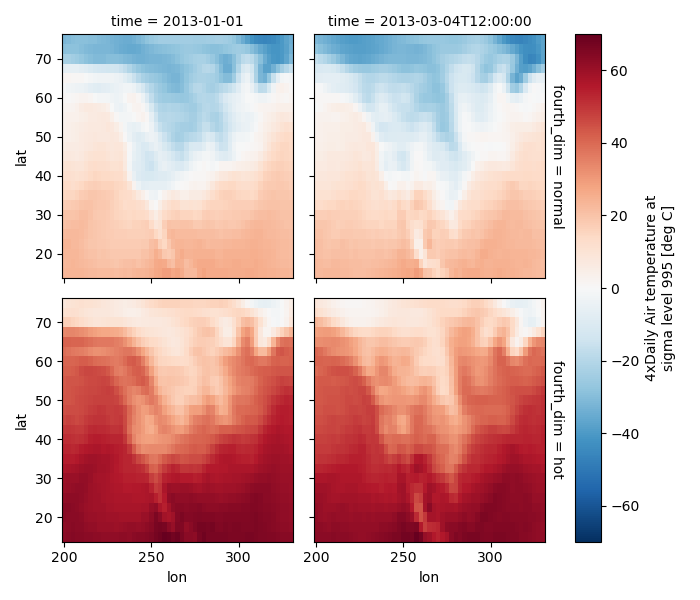
4 dimensional#
For 4 dimensional arrays we can use the rows and columns of the grids. Here we create a 4 dimensional array by taking the original data and adding a fixed amount. Now we can see how the temperature maps would compare if one were much hotter.
In [80]: t2 = t.isel(time=slice(0, 2))

In [81]: t4d = xr.concat([t2, t2 + 40], pd.Index(["normal", "hot"], name="fourth_dim"))

# This is a 4d array
In [82]: t4d.coords
Out[82]:
Coordinates:
  * lat         (lat) float32 100B 75.0 72.5 70.0 67.5 ... 22.5 20.0 17.5 15.0
  * lon         (lon) float32 212B 200.0 202.5 205.0 207.5 ... 325.0 327.5 330.0
  * time        (time) datetime64[ns] 16B 2013-01-01 2013-03-04T12:00:00
  * fourth_dim  (fourth_dim) object 16B 'normal' 'hot'

In [83]: t4d.plot(x="lon", y="lat", col="time", row="fourth_dim")
Out[83]: <xarray.plot.facetgrid.FacetGrid at 0x7f66ee127940>
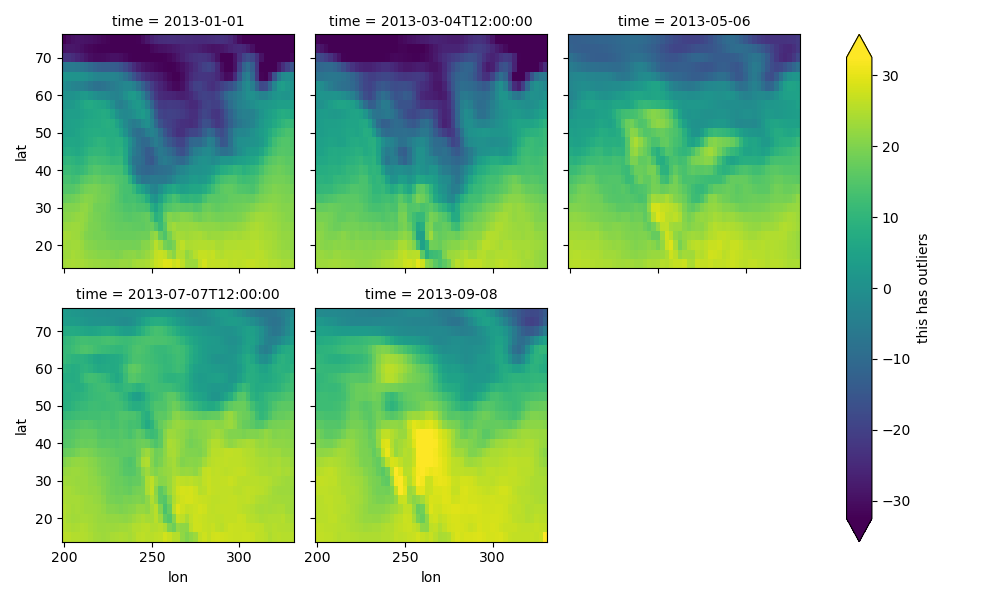
Other features#
Faceted plotting supports other arguments common to xarray 2d plots.
In [84]: hasoutliers = t.isel(time=slice(0, 5)).copy()

In [85]: hasoutliers[0, 0, 0] = -100

In [86]: hasoutliers[-1, -1, -1] = 400

In [87]: g = hasoutliers.plot.pcolormesh(
   ....:     x="lon",
   ....:     y="lat",
   ....:     col="time",
   ....:     col_wrap=3,
   ....:     robust=True,
   ....:     cmap="viridis",
   ....:     cbar_kwargs={"label": "this has outliers"},
   ....: )
   ....:
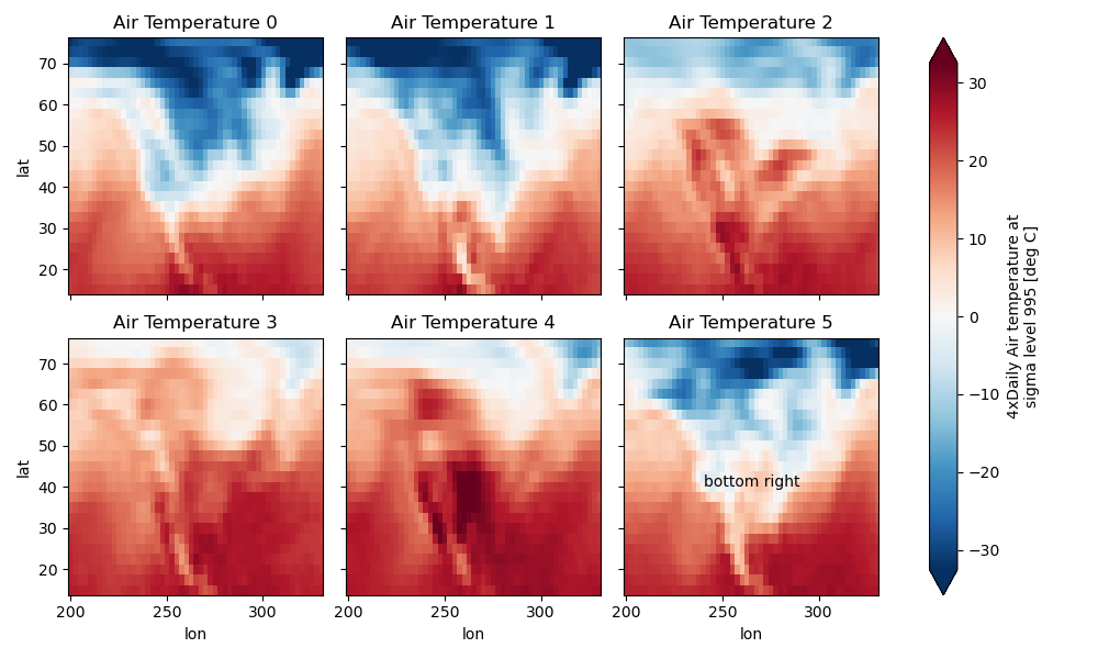
FacetGrid Objects#
The object returned, g in the above examples, is a FacetGrid object
that links a DataArray to a matplotlib figure with a particular structure.
This object can be used to control the behavior of the multiple plots.
It borrows an API and code from Seaborn’s FacetGrid.
The structure is contained within the axs and name_dicts
attributes, both 2d NumPy object arrays.
In [88]: g.axs
Out[88]:
array([[<Axes: title={'center': 'time = 2013-01-01'}, ylabel='lat'>,
        <Axes: title={'center': 'time = 2013-03-04T12:00:00'}>,
        <Axes: title={'center': 'time = 2013-05-06'}>],
       [<Axes: title={'center': 'time = 2013-07-07T12:00:00'}, xlabel='lon', ylabel='lat'>,
        <Axes: title={'center': 'time = 2013-09-08'}, xlabel='lon'>, <Axes: xlabel='lon'>]],
      dtype=object)

In [89]: g.name_dicts
Out[89]:
array([[{'time': numpy.datetime64('2013-01-01T00:00:00.000000000')},
        {'time': numpy.datetime64('2013-03-04T12:00:00.000000000')},
        {'time': numpy.datetime64('2013-05-06T00:00:00.000000000')}],
       [{'time': numpy.datetime64('2013-07-07T12:00:00.000000000')},
        {'time': numpy.datetime64('2013-09-08T00:00:00.000000000')}, None]], dtype=object)
It’s possible to select the xarray.DataArray or
xarray.Dataset corresponding to the FacetGrid through the
name_dicts.
In [90]: g.data.loc[g.name_dicts[0, 0]]
Out[90]:
<xarray.DataArray 'air' (lat: 25, lon: 53)> Size: 11kB
array([[-100.  ,  -30.65,  -29.65, ...,  -40.35,  -37.65,  -34.55],
       [ -29.35,  -28.65,  -28.45, ...,  -40.35,  -37.85,  -33.85],
       [ -23.15,  -23.35,  -24.26, ...,  -39.95,  -36.76,  -31.45],
       ...,
       [  23.45,   23.05,   23.25, ...,   22.25,   21.95,   21.55],
       [  22.75,   23.05,   23.64, ...,   22.75,   22.75,   22.05],
       [  23.14,   23.64,   23.95, ...,   23.75,   23.64,   23.45]])
Coordinates:
  * lat      (lat) float32 100B 75.0 72.5 70.0 67.5 65.0 ... 22.5 20.0 17.5 15.0
  * lon      (lon) float32 212B 200.0 202.5 205.0 207.5 ... 325.0 327.5 330.0
    time     datetime64[ns] 8B 2013-01-01
Attributes:
    long_name:     4xDaily Air temperature at sigma level 995
    units:         deg C
    precision:     2
    GRIB_id:       11
    GRIB_name:     TMP
    var_desc:      Air temperature
    dataset:       NMC Reanalysis
    level_desc:    Surface
    statistic:     Individual Obs
    parent_stat:   Other
    actual_range:  [185.16 322.1 ]
Here is an example of using the lower level API and then modifying the axes after they have been plotted.
In [91]: g = t.plot.imshow(x="lon", y="lat", col="time", col_wrap=3, robust=True)

In [92]: for i, ax in enumerate(g.axs.flat):
   ....:     ax.set_title("Air Temperature %d" % i)
   ....:

In [93]: bottomright = g.axs[-1, -1]

In [94]: bottomright.annotate("bottom right", (240, 40))
Out[94]: Text(240, 40, 'bottom right')

In [95]: plt.draw()
FacetGrid objects have methods that let you customize the automatically generated
axis labels, axis ticks and plot titles. See set_titles(),
set_xlabels(), set_ylabels() and
set_ticks() for more information.
Plotting functions can be applied to each subset of the data by calling
map_dataarray() or to each subplot by calling map().
TODO: add an example of using the map method to plot dataset variables
(e.g., with plt.quiver).
Datasets#
Xarray has limited support for plotting Dataset variables against each other. Consider this dataset
In [96]: ds = xr.tutorial.scatter_example_dataset(seed=42)

In [97]: ds
Out[97]:
<xarray.Dataset> Size: 9kB
Dimensions:  (x: 3, y: 11, z: 4, w: 4)
Coordinates:
  * x        (x) int64 24B 0 1 2
  * y        (y) float64 88B 0.0 0.1 0.2 0.3 0.4 0.5 0.6 0.7 0.8 0.9 1.0
  * z        (z) int64 32B 0 1 2 3
  * w        (w) <U5 80B 'one' 'two' 'three' 'five'
Data variables:
    A        (x, y, z, w) float64 4kB 0.03047 -0.104 ... 4.512e-05 0.01906
    B        (x, y, z, w) float64 4kB 0.0 0.0 0.0 0.0 ... 1.369 1.423 1.428
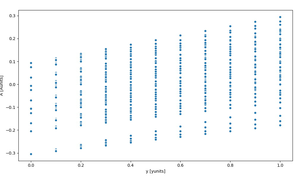
Scatter#
Let’s plot the A DataArray as a function of the y coord
In [98]: ds.A
Out[98]:
<xarray.DataArray 'A' (x: 3, y: 11, z: 4, w: 4)> Size: 4kB
array([[[[ 3.047e-02, -1.040e-01, 7.505e-02, 9.406e-02],
[ 3.047e-02, -1.040e-01, 7.505e-02, 9.406e-02],
[ 3.047e-02, -1.040e-01, 7.505e-02, 9.406e-02],
[ 3.047e-02, -1.040e-01, 7.505e-02, 9.406e-02]],
[[ 5.047e-02, -8.400e-02, 9.505e-02, 1.141e-01],
[ 4.714e-02, -8.733e-02, 9.171e-02, 1.107e-01],
[ 4.476e-02, -8.971e-02, 8.933e-02, 1.083e-01],
[ 4.297e-02, -9.150e-02, 8.755e-02, 1.066e-01]],
[[ 7.047e-02, -6.400e-02, 1.150e-01, 1.341e-01],
[ 6.381e-02, -7.067e-02, 1.084e-01, 1.274e-01],
[ 5.904e-02, -7.543e-02, 1.036e-01, 1.226e-01],
[ 5.547e-02, -7.900e-02, 1.000e-01, 1.191e-01]],
...,
[[ 1.905e-01, 5.600e-02, 2.350e-01, 2.541e-01],
[ 1.638e-01, 2.933e-02, 2.084e-01, 2.274e-01],
[ 1.448e-01, 1.029e-02, 1.893e-01, 2.083e-01],
...
[-1.362e-01, -2.707e-01, -9.162e-02, -7.261e-02],
[-1.410e-01, -2.754e-01, -9.638e-02, -7.737e-02],
[-1.445e-01, -2.790e-01, -9.995e-02, -8.094e-02]],
...,
[[-9.528e-03, -1.440e-01, 3.505e-02, 5.406e-02],
[-3.619e-02, -1.707e-01, 8.378e-03, 2.739e-02],
[-5.524e-02, -1.897e-01, -1.067e-02, 8.342e-03],
[-6.953e-02, -2.040e-01, -2.495e-02, -5.944e-03]],
[[ 1.047e-02, -1.240e-01, 5.505e-02, 7.406e-02],
[-1.953e-02, -1.540e-01, 2.505e-02, 4.406e-02],
[-4.096e-02, -1.754e-01, 3.617e-03, 2.263e-02],
[-5.703e-02, -1.915e-01, -1.245e-02, 6.556e-03]],
[[ 3.047e-02, -1.040e-01, 7.505e-02, 9.406e-02],
[-2.862e-03, -1.373e-01, 4.171e-02, 6.072e-02],
[-2.667e-02, -1.611e-01, 1.790e-02, 3.691e-02],
[-4.453e-02, -1.790e-01, 4.512e-05, 1.906e-02]]]])
Coordinates:
* x (x) int64 24B 0 1 2
* y (y) float64 88B 0.0 0.1 0.2 0.3 0.4 0.5 0.6 0.7 0.8 0.9 1.0
* z (z) int64 32B 0 1 2 3
* w (w) <U5 80B 'one' 'two' 'three' 'five'
Attributes:
units: Aunits
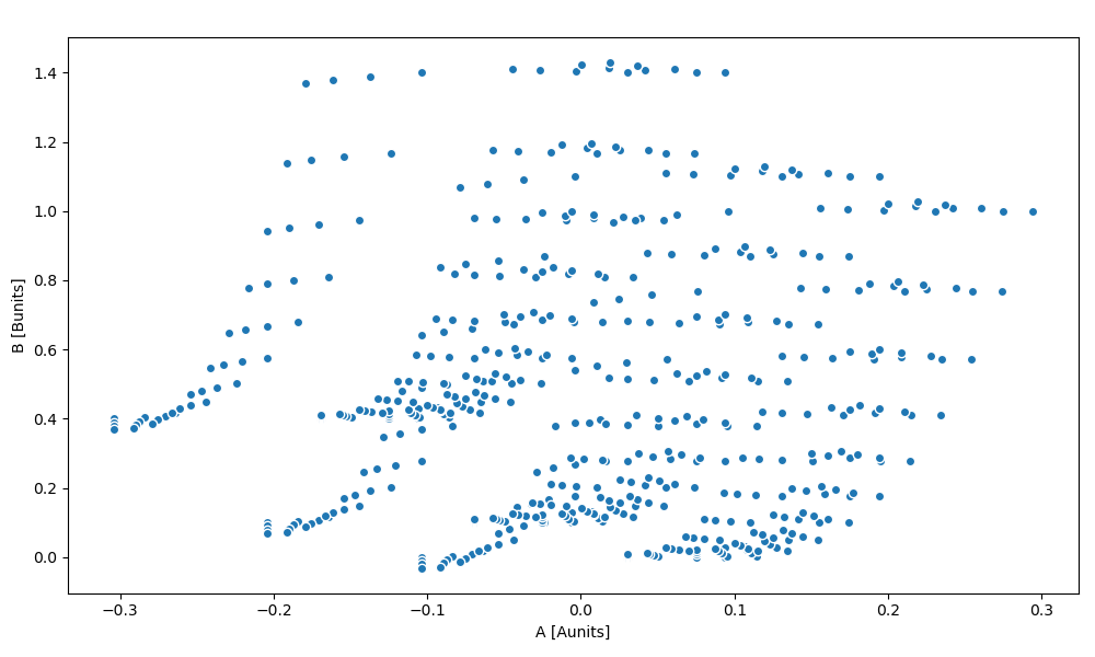
In [99]: ds.A.plot.scatter(x="y")
Out[99]: <matplotlib.collections.PathCollection at 0x7f66eda632b0>
Same plot can be displayed using the dataset:
In [100]: ds.plot.scatter(x="y", y="A")
Out[100]: <matplotlib.collections.PathCollection at 0x7f66eda63d90>

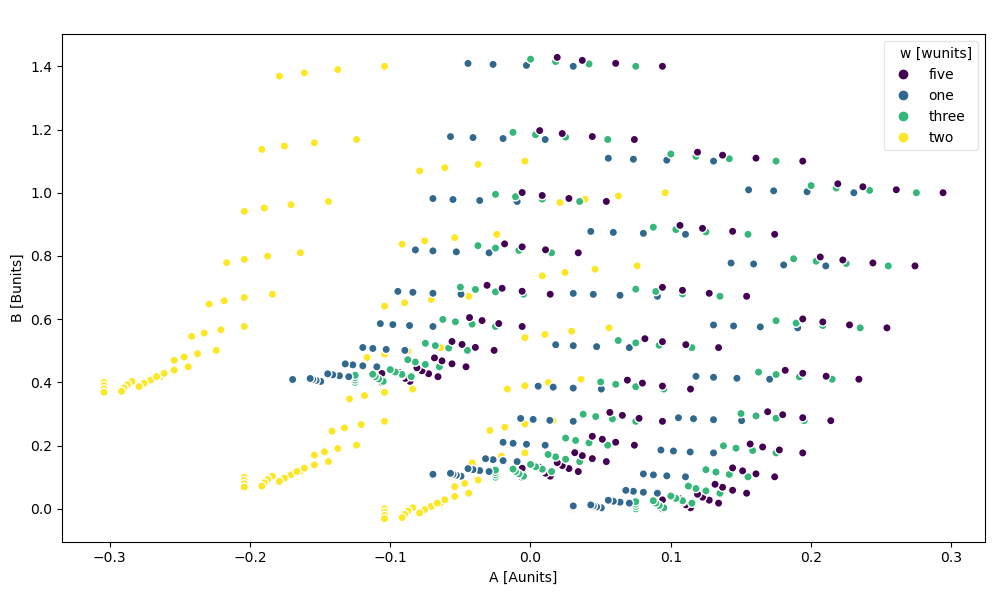
Now suppose we want to scatter the A DataArray against the B DataArray
In [101]: ds.plot.scatter(x="A", y="B")
Out[101]: <matplotlib.collections.PathCollection at 0x7f66edd0cfa0>
The hue kwarg lets you vary the color by variable value
In [102]: ds.plot.scatter(x="A", y="B", hue="w")
Out[102]: <matplotlib.collections.PathCollection at 0x7f66eda0bd90>

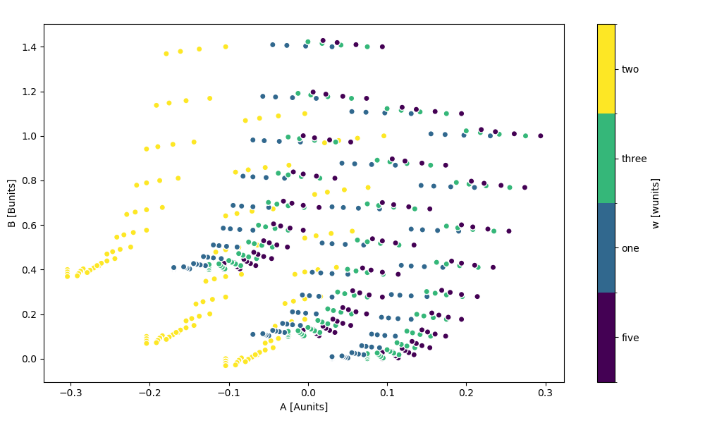
You can force a legend instead of a colorbar by setting add_legend=True, add_colorbar=False.
In [103]: ds.plot.scatter(x="A", y="B", hue="w", add_legend=True, add_colorbar=False)
Out[103]: <matplotlib.collections.PathCollection at 0x7f66edad5540>
In [104]: ds.plot.scatter(x="A", y="B", hue="w", add_legend=False, add_colorbar=True)
Out[104]: <matplotlib.collections.PathCollection at 0x7f66ed9b4ca0>
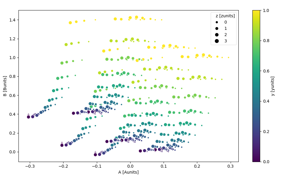
The markersize kwarg lets you vary the point’s size by variable value.
You can additionally pass size_norm to control how the variable’s values are mapped to point sizes.
In [105]: ds.plot.scatter(x="A", y="B", hue="y", markersize="z")
Out[105]: <matplotlib.collections.PathCollection at 0x7f66edad5d80>
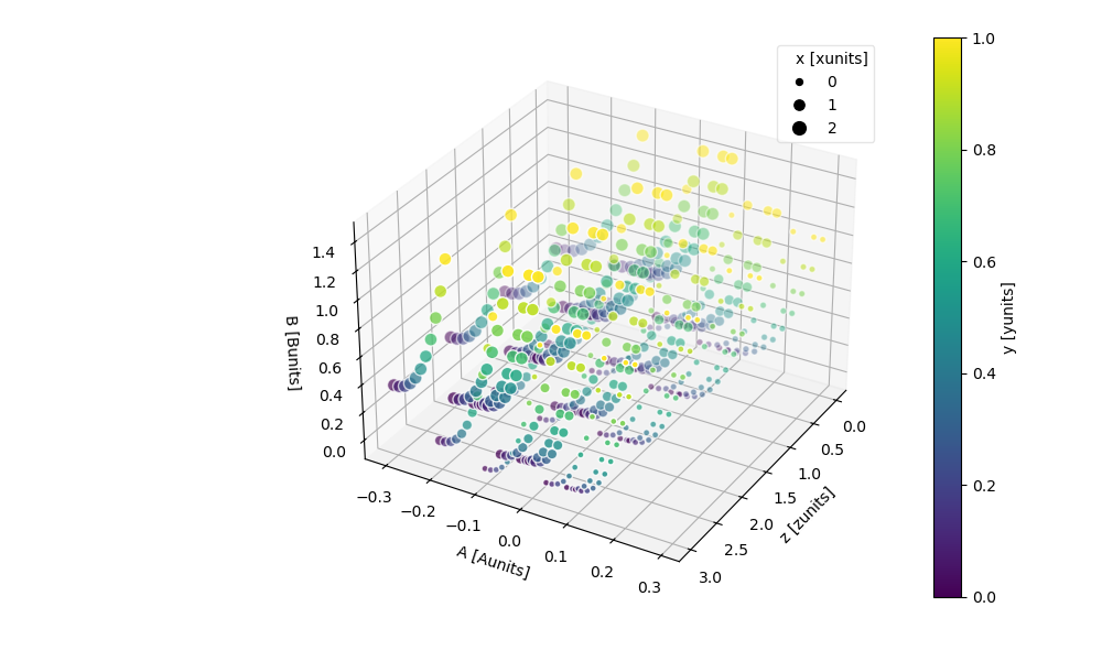
The z kwarg lets you plot the data along the z-axis as well.
In [106]: ds.plot.scatter(x="A", y="B", z="z", hue="y", markersize="x")
Out[106]: <mpl_toolkits.mplot3d.art3d.Path3DCollection at 0x7f66ed7506d0>
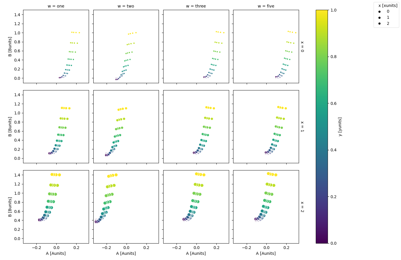
Faceting is also possible
In [107]: ds.plot.scatter(x="A", y="B", hue="y", markersize="x", row="x", col="w")
Out[107]: <xarray.plot.facetgrid.FacetGrid at 0x7f66edf18d60>
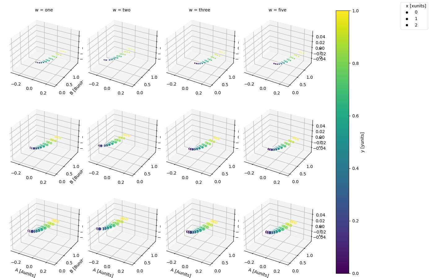
And adding the z-axis
In [108]: ds.plot.scatter(x="A", y="B", z="z", hue="y", markersize="x", row="x", col="w")
Out[108]: <xarray.plot.facetgrid.FacetGrid at 0x7f66ed1385b0>
For more advanced scatter plots, we recommend converting the relevant data variables
to a pandas DataFrame and using the extensive plotting capabilities of seaborn.
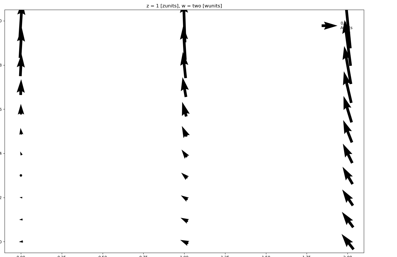
Quiver#
Visualizing vector fields is supported with quiver plots:
In [109]: ds.isel(w=1, z=1).plot.quiver(x="x", y="y", u="A", v="B")
Out[109]: <matplotlib.quiver.Quiver at 0x7f66f06559c0>
where u and v denote the x and y direction components of the arrow vectors. Again, faceting is also possible:
In [110]: ds.plot.quiver(x="x", y="y", u="A", v="B", col="w", row="z", scale=4)
Out[110]: <xarray.plot.facetgrid.FacetGrid at 0x7f66ee126ef0>
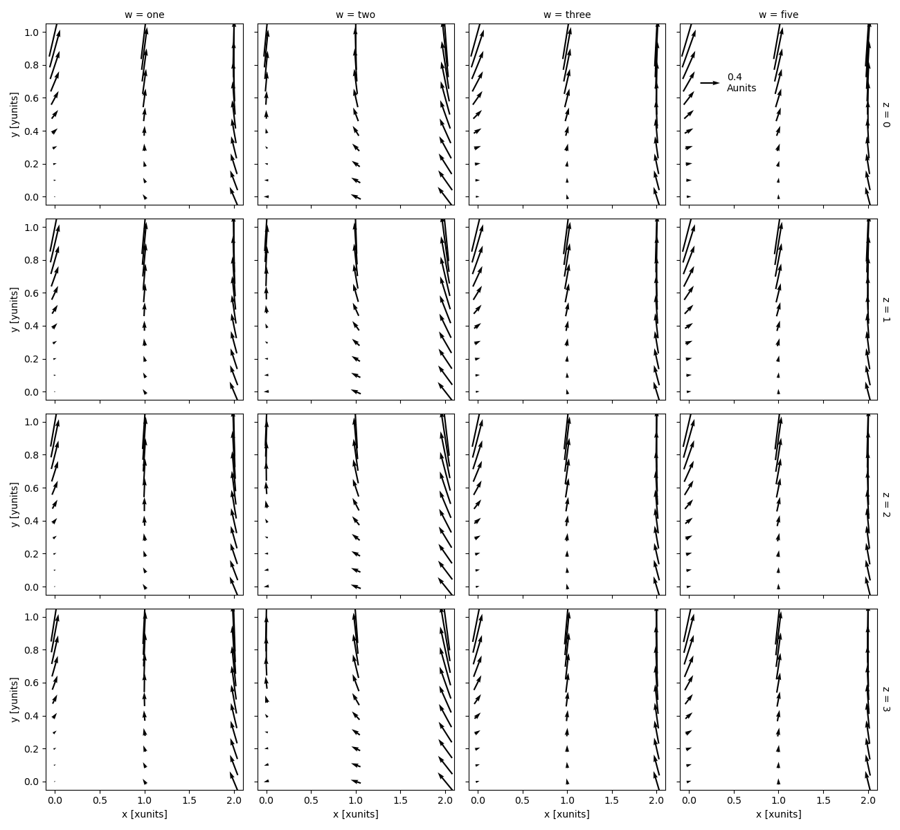
scale is required for faceted quiver plots.
The scale determines the number of data units per arrow length unit, i.e. a smaller scale parameter makes the arrow longer.
Streamplot#
Visualizing vector fields is also supported with streamline plots:
In [111]: ds.isel(w=1, z=1).plot.streamplot(x="x", y="y", u="A", v="B")
Out[111]: <matplotlib.collections.LineCollection at 0x7f66ecfc52d0>
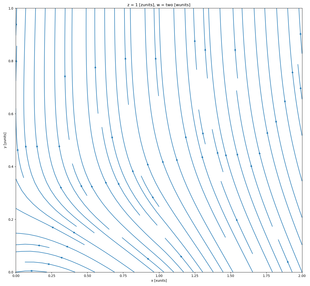
where u and v denote the x and y direction components of the vectors tangent to the streamlines.
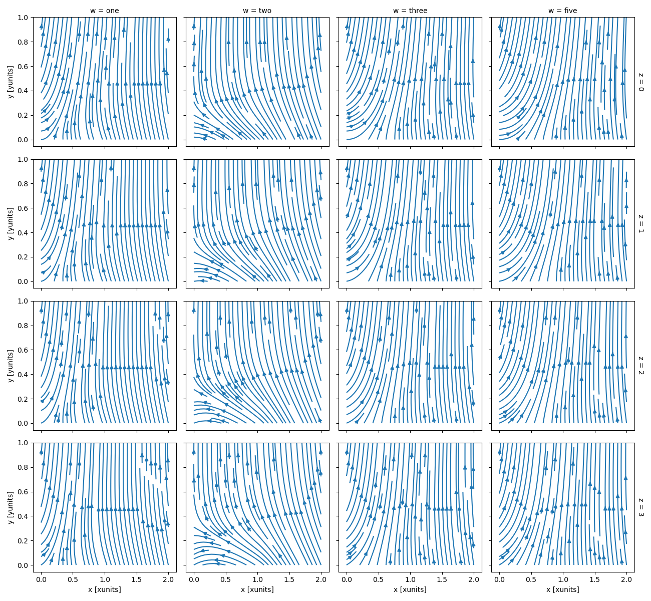
Again, faceting is also possible:
In [112]: ds.plot.streamplot(x="x", y="y", u="A", v="B", col="w", row="z")
Out[112]: <xarray.plot.facetgrid.FacetGrid at 0x7f66ecf72d10>
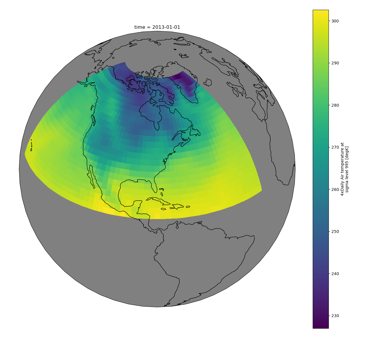
Maps#
To follow this section you’ll need to have Cartopy installed and working.
This script will plot the air temperature on a map.
In [113]: import cartopy.crs as ccrs

In [114]: air = xr.tutorial.open_dataset("air_temperature").air

In [115]: p = air.isel(time=0).plot(
   .....:     subplot_kws=dict(projection=ccrs.Orthographic(-80, 35), facecolor="gray"),
   .....:     transform=ccrs.PlateCarree(),
   .....: )
   .....:

In [116]: p.axes.set_global()

In [117]: p.axes.coastlines()
Out[117]: <cartopy.mpl.feature_artist.FeatureArtist at 0x7f66ed2c8370>
When faceting on maps, the projection can be transferred to the plot
function using the subplot_kws keyword. The axes for the subplots created
by faceting are accessible in the object returned by plot:
In [118]: p = air.isel(time=[0, 4]).plot(
   .....:     transform=ccrs.PlateCarree(),
   .....:     col="time",
   .....:     subplot_kws={"projection": ccrs.Orthographic(-80, 35)},
   .....: )
   .....:

In [119]: for ax in p.axs.flat:
   .....:     ax.coastlines()
   .....:     ax.gridlines()
   .....:

In [120]: plt.draw()
Details#
Ways to Use#
There are three ways to use the xarray plotting functionality:
Use
plotas a convenience method for a DataArray.Access a specific plotting method from the
plotattribute of a DataArray.Directly from the xarray plot submodule.
These are provided for user convenience; they all call the same code.
In [121]: import xarray.plot as xplt

In [122]: da = xr.DataArray(range(5))

In [123]: fig, axs = plt.subplots(ncols=2, nrows=2)

In [124]: da.plot(ax=axs[0, 0])
Out[124]: [<matplotlib.lines.Line2D at 0x7f66ec568eb0>]

In [125]: da.plot.line(ax=axs[0, 1])
Out[125]: [<matplotlib.lines.Line2D at 0x7f66ec5692a0>]

In [126]: xplt.plot(da, ax=axs[1, 0])
Out[126]: [<matplotlib.lines.Line2D at 0x7f66ecf36770>]

In [127]: xplt.line(da, ax=axs[1, 1])
Out[127]: [<matplotlib.lines.Line2D at 0x7f66ecf34850>]

In [128]: plt.tight_layout()

In [129]: plt.draw()
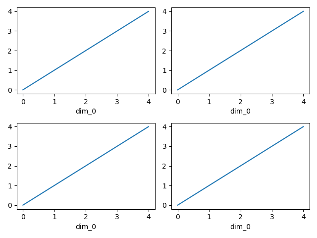
Here the output is the same. Since the data is 1 dimensional the line plot was used.
The convenience method xarray.DataArray.plot() dispatches to an appropriate
plotting function based on the dimensions of the DataArray and whether
the coordinates are sorted and uniformly spaced. This table
describes what gets plotted:
Dimensions |
Plotting function |
1 |
|
2 |
|
Anything else |
Coordinates#
If you’d like to find out what’s really going on in the coordinate system, read on.
In [130]: a0 = xr.DataArray(np.zeros((4, 3, 2)), dims=("y", "x", "z"), name="temperature")

In [131]: a0[0, 0, 0] = 1

In [132]: a = a0.isel(z=0)

In [133]: a
Out[133]:
<xarray.DataArray 'temperature' (y: 4, x: 3)> Size: 96B
array([[1., 0., 0.],
       [0., 0., 0.],
       [0., 0., 0.],
       [0., 0., 0.]])
Dimensions without coordinates: y, x
The plot will produce an image corresponding to the values of the array. Hence the top left pixel will be a different color than the others. Before reading on, you may want to look at the coordinates and think carefully about what the limits, labels, and orientation for each of the axes should be.
In [134]: a.plot()
Out[134]: <matplotlib.collections.QuadMesh at 0x7f66ec584700>
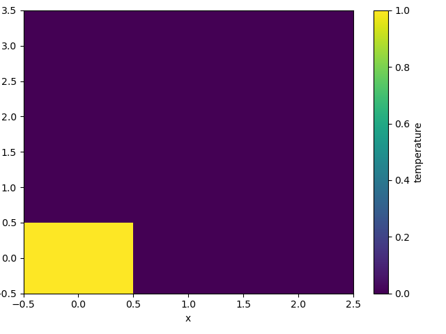
It may seem strange that the values on the y axis are decreasing with -0.5 on the top. This is because the pixels are centered over their coordinates, and the axis labels and ranges correspond to the values of the coordinates.
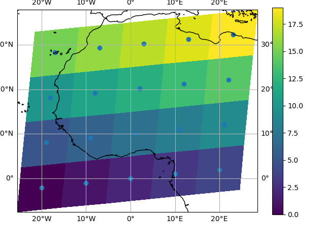
Multidimensional coordinates#
See also: Working with Multidimensional Coordinates.
You can plot irregular grids defined by multidimensional coordinates with xarray, but you’ll have to tell the plot function to use these coordinates instead of the default ones:
In [135]: lon, lat = np.meshgrid(np.linspace(-20, 20, 5), np.linspace(0, 30, 4))

In [136]: lon += lat / 10

In [137]: lat += lon / 10

In [138]: da = xr.DataArray(
   .....:     np.arange(20).reshape(4, 5),
   .....:     dims=["y", "x"],
   .....:     coords={"lat": (("y", "x"), lat), "lon": (("y", "x"), lon)},
   .....: )
   .....:

In [139]: da.plot.pcolormesh(x="lon", y="lat")
Out[139]: <matplotlib.collections.QuadMesh at 0x7f66ec5a9b40>
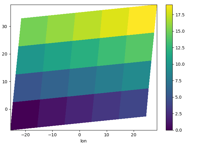
Note that in this case, xarray still follows the pixel centered convention. This might be undesirable in some cases, for example when your data is defined on a polar projection (GH781). This is why the default is to not follow this convention when plotting on a map:
In [140]: import cartopy.crs as ccrs

In [141]: ax = plt.subplot(projection=ccrs.PlateCarree())

In [142]: da.plot.pcolormesh(x="lon", y="lat", ax=ax)
Out[142]: <cartopy.mpl.geocollection.GeoQuadMesh at 0x7f66ec243ee0>

In [143]: ax.scatter(lon, lat, transform=ccrs.PlateCarree())
Out[143]: <matplotlib.collections.PathCollection at 0x7f66ec242b90>

In [144]: ax.coastlines()
Out[144]: <cartopy.mpl.feature_artist.FeatureArtist at 0x7f66ec351cf0>

In [145]: ax.gridlines(draw_labels=True)
Out[145]: <cartopy.mpl.gridliner.Gridliner at 0x7f66ec2758a0>
You can however decide to infer the cell boundaries and use the
infer_intervals keyword:
In [146]: ax = plt.subplot(projection=ccrs.PlateCarree())

In [147]: da.plot.pcolormesh(x="lon", y="lat", ax=ax, infer_intervals=True)
Out[147]: <cartopy.mpl.geocollection.GeoQuadMesh at 0x7f66ec2e3eb0>

In [148]: ax.scatter(lon, lat, transform=ccrs.PlateCarree())
Out[148]: <matplotlib.collections.PathCollection at 0x7f66ec249ab0>

In [149]: ax.coastlines()
Out[149]: <cartopy.mpl.feature_artist.FeatureArtist at 0x7f66ec275c60>

In [150]: ax.gridlines(draw_labels=True)
Out[150]: <cartopy.mpl.gridliner.Gridliner at 0x7f66ec2e2bc0>

Note
The data model of xarray does not support datasets with cell boundaries yet. If you want to use these coordinates, you’ll have to make the plots outside the xarray framework.
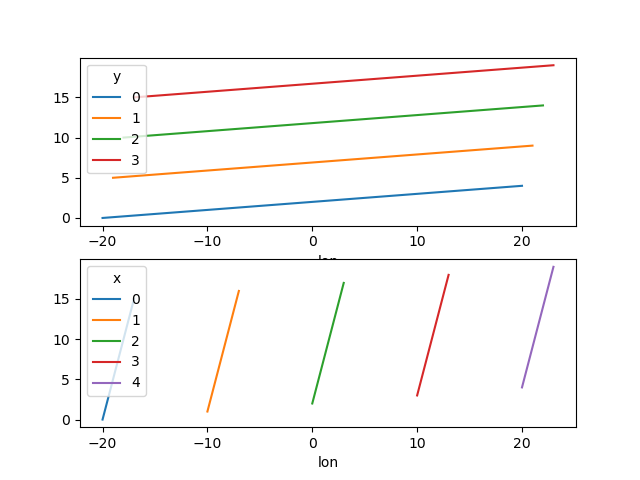
One can also make line plots with multidimensional coordinates. In this case, hue must be a dimension name, not a coordinate name.
In [151]: f, ax = plt.subplots(2, 1)

In [152]: da.plot.line(x="lon", hue="y", ax=ax[0])
Out[152]:
[<matplotlib.lines.Line2D at 0x7f66ec192d70>,
 <matplotlib.lines.Line2D at 0x7f66ec192da0>,
 <matplotlib.lines.Line2D at 0x7f66ec192e90>,
 <matplotlib.lines.Line2D at 0x7f66ec1930a0>]

In [153]: da.plot.line(x="lon", hue="x", ax=ax[1])
Out[153]:
[<matplotlib.lines.Line2D at 0x7f66ec1a1030>,
 <matplotlib.lines.Line2D at 0x7f66ec1a1060>,
 <matplotlib.lines.Line2D at 0x7f66ec1a1180>,
 <matplotlib.lines.Line2D at 0x7f66ec1a1270>,
 <matplotlib.lines.Line2D at 0x7f66ec1a1360>]